Building a Design System to Scale a B2B SaaS Platform
Establishing a shared design foundation to reduce inconsistency, accelerate delivery, and support scale across DayaTani’s enterprise web and mobile products.
Key Outcomes
↓ ~45% UI inconsistency across core products
↓ 50% Figma memory usage
Overview
As DayaTani’s products expanded across web and mobile, UI patterns and components quickly diverged, creating inconsistencies and slowing design–engineering collaboration.
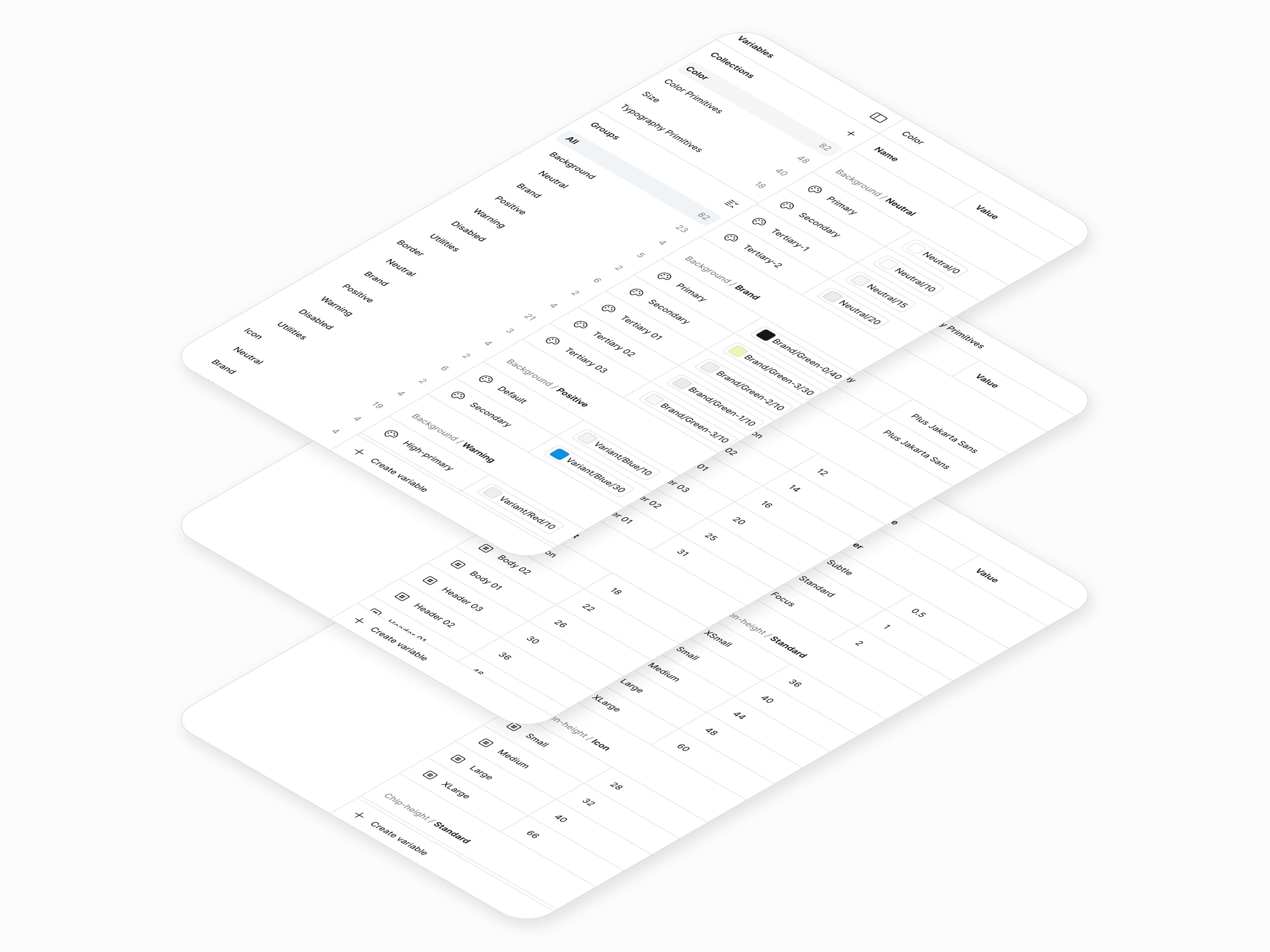
This project established DayaTani’s first design system. A shared foundation focused on consistency, scalability, and operational efficiency rather than visual polish.
The challenge was introducing structure without slowing delivery or disrupting active product development.
My Role
Proposed and initiated the creation of DayaTani’s first design system
Led end-to-end system design across tokens, components, and patterns
Defined cross-platform standards for web and mobile products
Maintained and evolved the system alongside active product development
Partnered closely with engineers and PMs to ensure adoption and alignment
Team
1 Designer
2–3 Engineers (per product area)
PMs across multiple initiatives
Duration
~4 months initial build, followed by ongoing iteration and maintenance
Problems
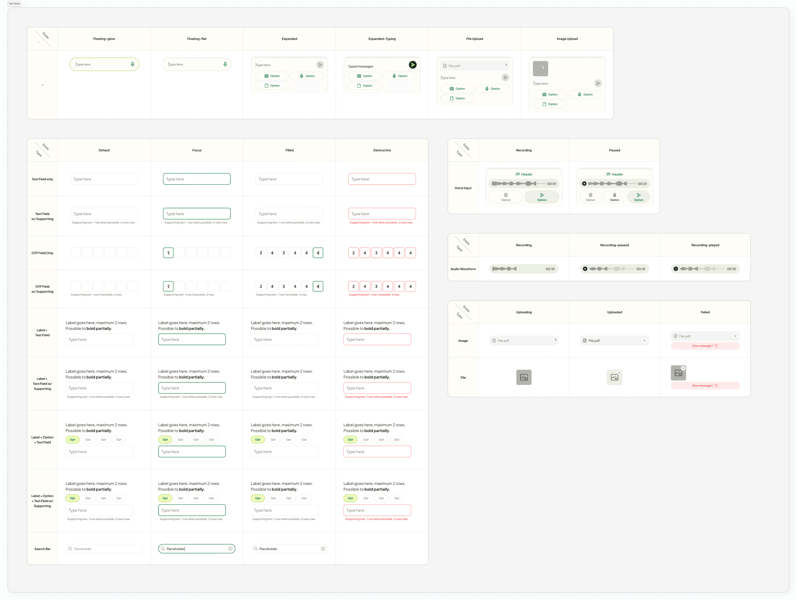
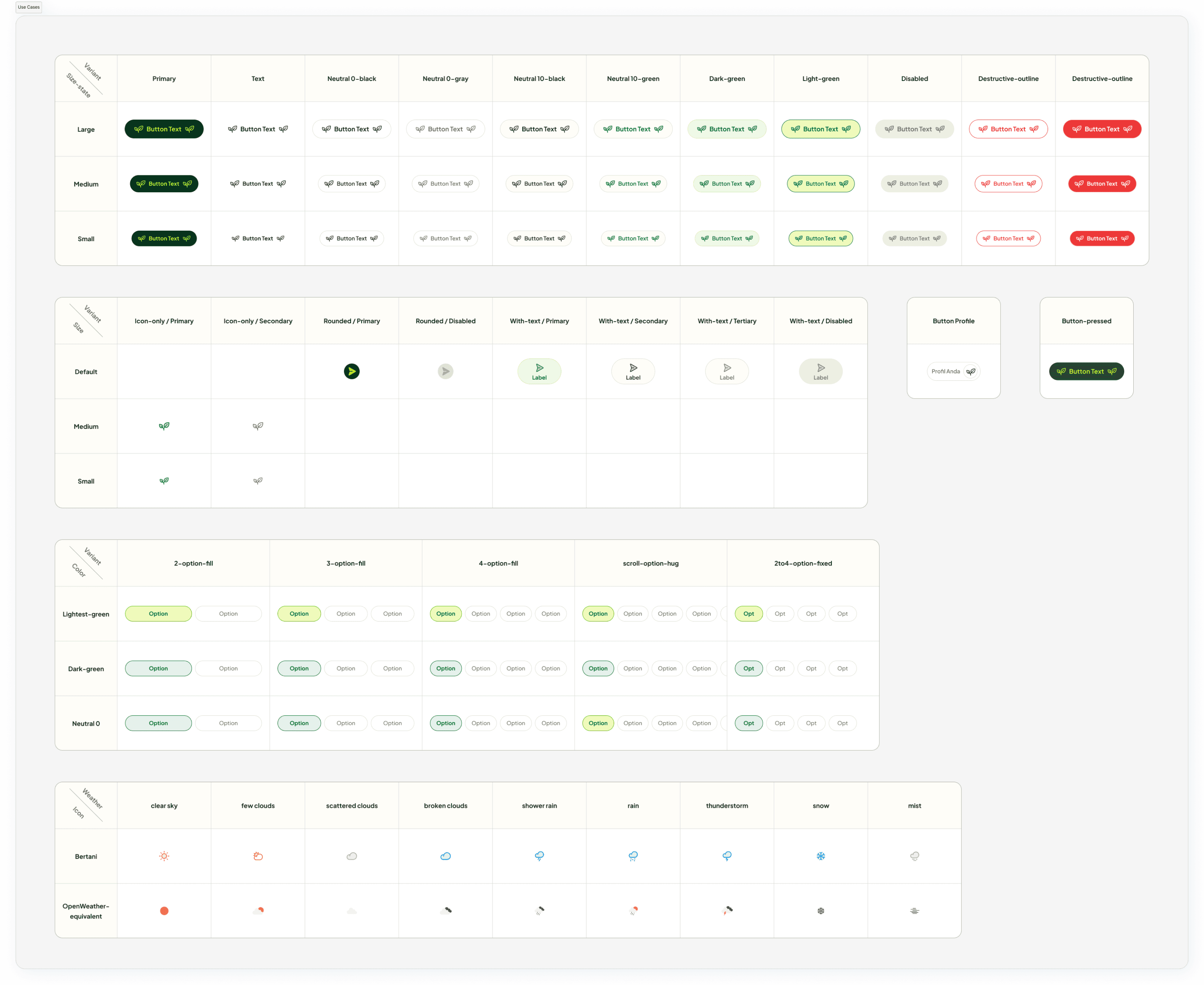
UI components were inconsistently implemented across products
Design patterns diverged between web and mobile experiences
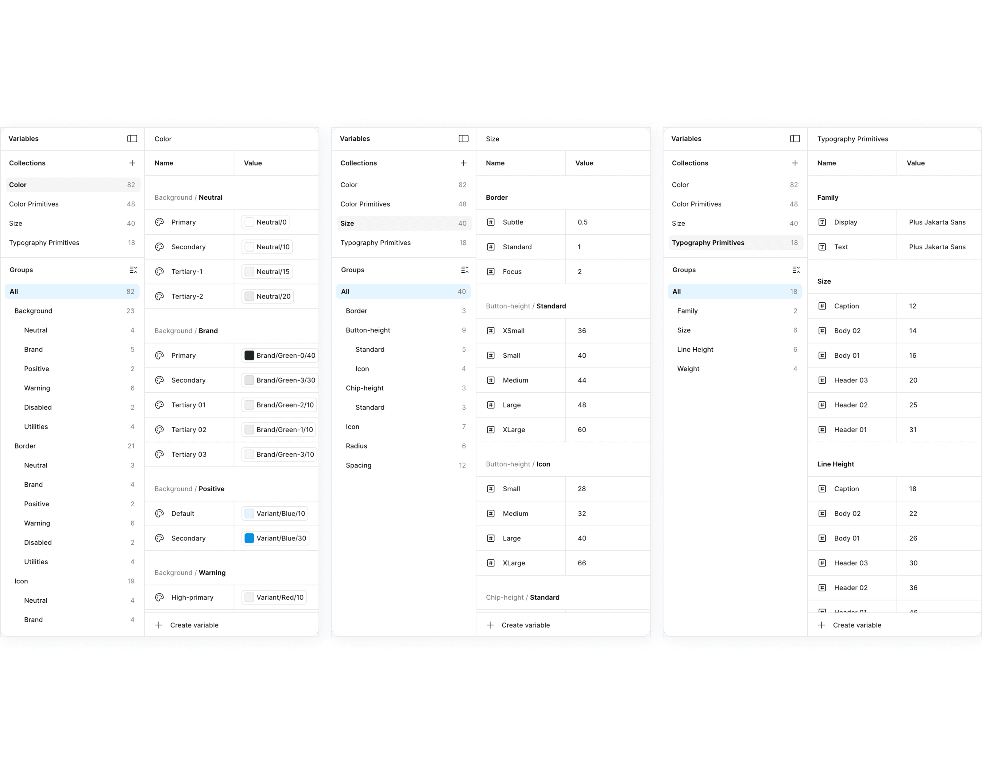
Figma files became large, slow, and difficult to maintain
Engineers re-implemented similar UI patterns repeatedly
Design decisions lacked a shared source of truth
The core issue wasn’t visual design; it was lack of a scalable design foundation.
Key Constraints
Multiple enterprise products already in active use
No prior system ownership or shared standards
Tight delivery timelines alongside system work
Need to support both web and mobile platforms
Adoption had to be gradual, not disruptive
Any solution needed to improve speed and consistency without blocking ongoing delivery.
Key Design Decisions & Trade-offs
Foundations over features
The system prioritized tokens, core components, and interaction patterns rather than exhaustive component coverage, accepting slower initial breadth for long-term scalability.
Consistency over local optimization
Teams were encouraged to converge on shared patterns, trading some feature-level customization for a more cohesive and maintainable product experience.
Adoption through usefulness, not enforcement
The system was designed to be lightweight and practical, relying on clear value and ease of use rather than strict governance to drive adoption.
Adoption Strategy & Guardrails
Started with high-impact foundations
The system prioritized tokens, core components, and interaction patterns rather than exhaustive component coverage, accepting slower initial breadth for long-term scalability.
Designed for active work
Components and patterns were introduced through active product work, allowing teams to experience benefits organically rather than through mandates.
Balanced flexibility with consistency
Teams retained room for contextual variation, but deviations were made explicit and reviewable to prevent fragmentation from re-emerging.
Outcomes (cont.)
The design system became a shared foundation that reduced fragmentation and improved delivery efficiency across teams.
As products adopted shared tokens and components, UI inconsistencies dropped and design files became easier to maintain. Designers and engineers spent less time re-solving common patterns and more time on product-specific problems.
This resulted in:
~45% reduction in UI inconsistencies across enterprise products
50% reduction in Figma memory usage, improving performance and maintainability
Faster design–engineering handoff, through shared patterns and clearer specifications
More consistent cross-platform experiences, across web and mobile